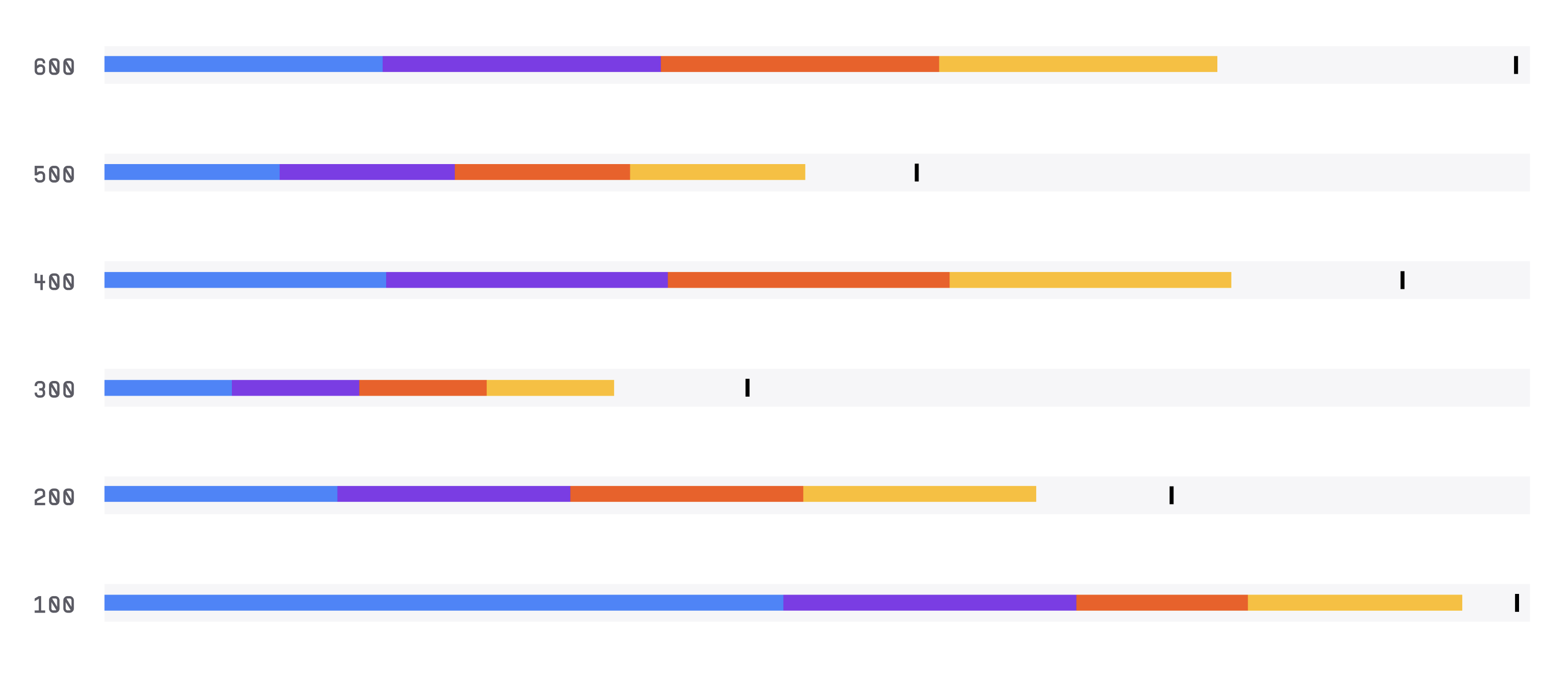
Bullet Chart
The Bullet Graph is a data visualization chart that is used to display a single measure along with a target value and other related data points. It is often used to show progress towards a goal or target value.
Plotting
To construct a Bullet Graph, you start by plotting a horizontal line to represent the target value.
Then, you add a vertical bar to represent the actual value of the measure being tracked.
The bar is colored to indicate whether the actual value is above or below the target value.
The graph can also include other data points such as previous periods' values and ranges of values.
Summary
The Bullet Graph is often used to display key performance indicators (KPIs) in business and financial settings.
It can help identify areas of improvement and track progress towards goals.
The chart is designed to be easy to read and interpret.
One advantage of the Bullet Graph is that it provides a clear and concise way to compare the actual and target values of a measure.
The design of the graph minimizes chartjunk and maximizes the data-ink ratio, making it easy to read and understand.
Additionally, the graph can be customized to include additional data points or to fit specific design requirements.
Overall, the Bullet Graph is a useful tool for visualizing a single measure along with a target value and related data points.
It is easy to construct and interpret, making it a popular choice for data visualization in business and finance.