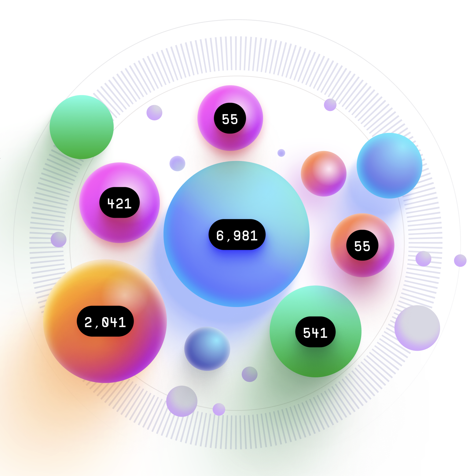
Bubble Chart
The Bubble Chart is a data visualization chart that is used to display three dimensions of data simultaneously. It is often used to visualize complex datasets with multiple variables. The chart uses bubble markers to represent data points and their sizes to represent the value of the third variable.
Plotting
To construct a Bubble Chart, you start by plotting two dimensions of data on a two-dimensional plane.
The third variable is then represented by the size of the bubble markers.
Each bubble marker represents a data point and its size represents the value of the third variable.
The bubbles can also be color-coded to represent different categories or groups in the dataset.
Summary
The Bubble Chart is often used to visualize the relationships between three variables in a dataset.
It can help identify patterns and trends in the data and highlight outliers.
The chart is particularly useful for datasets with a large number of data points.
One advantage of the Bubble Chart is that it allows for the easy identification of relationships and patterns between three variables.
By examining the size and color of the bubbles, you can quickly identify trends and outliers in the data.
Additionally, the chart is easy to interpret and visually appealing.
Overall, the Bubble Chart is a useful tool for visualizing three dimensions of data simultaneously.
It is easy to construct and interpret, making it a popular choice for data visualization.
The chart is commonly used in business, finance, and scientific research to analyze complex datasets.