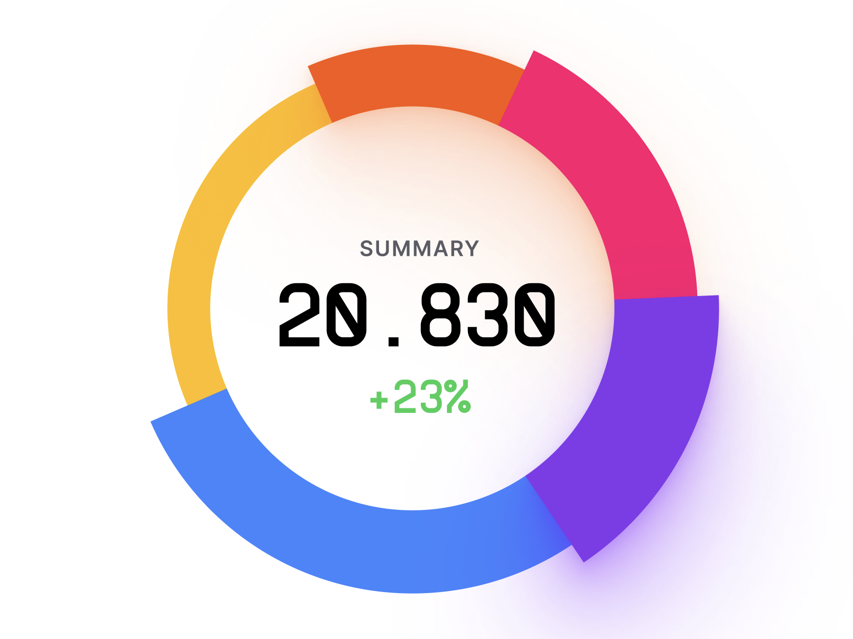
Pie Chart
Pie chart is a type of chart used to display data as a circle divided into slices. Each slice represents a portion of the whole, with the size of the slice proportional to the value it represents.
Plotting
To build a pie chart, you would typically need one set of data that adds up to a whole.
You would then divide the whole into slices proportional to the value of each category.
The slices are usually labeled with the category name and the percentage or value it represents.
Summary
Pie charts are commonly used to show the distribution of data within a whole, and are often used in business, finance, and other fields to visualize data such as market share, budget allocation, and survey results.
For example, a company might use a pie chart to show the market share of different competitors in a particular market.
One advantage of pie charts is that they are easy to read and understand, and can quickly convey the relative sizes of different categories.
However, they can be less effective when there are too many categories or when the differences between categories are small.
Overall, pie charts are a useful tool for visualizing data that adds up to a whole, and can be used in a variety of fields to help people understand complex data sets.