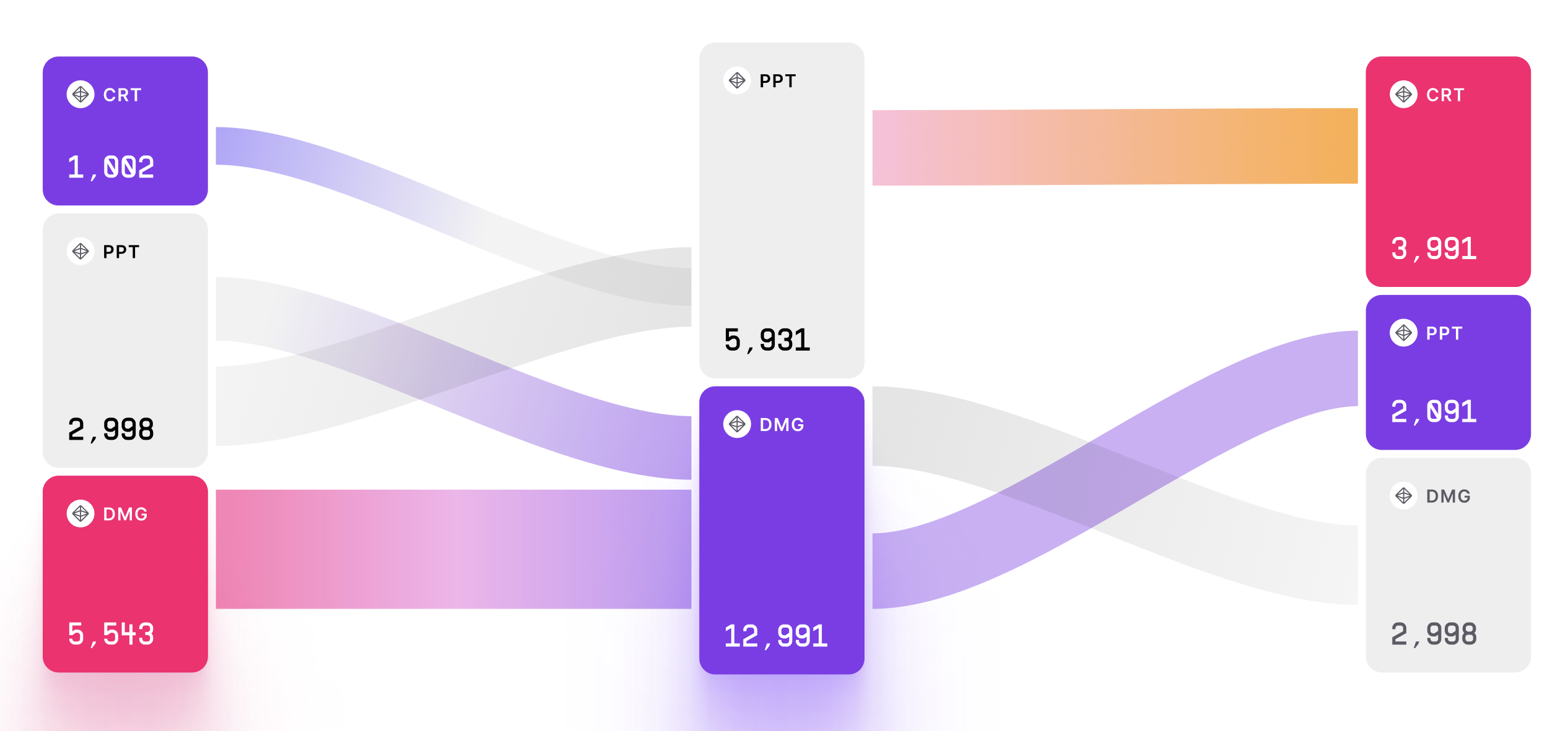
Sankey Chart
Sankey Chart is a data visualization chart that is used to show the flow of data or resources through a system. It is often used to display complex processes or systems in a clear and concise way.
Plotting
To construct a Sankey Chart, you start with a series of nodes that represent different stages or components of the system.
The nodes are connected by flows that represent the movement of data or resources between the different stages or components.
The width of each flow is proportional to the quantity of data or resources that move through it.
Summary
The Sankey Chart is often used to analyze complex systems or processes.
It can help identify areas where resources are being wasted or where bottlenecks occur.
The chart is commonly used in business, finance, and scientific research to analyze complex datasets.
One advantage of the Sankey Chart is that it provides a clear and concise way to display the flow of data or resources through a system.
The design of the chart can be customized to include additional data points or to fit specific design requirements.
Additionally, the chart can be interactive, allowing for the exploration of different levels of data.
Overall, the Sankey Chart is a useful tool for visualizing the flow of data or resources through a system.
It is easy to construct and interpret, making it a popular choice for data visualization.
The chart is commonly used in business, finance, and scientific research to analyze complex datasets.