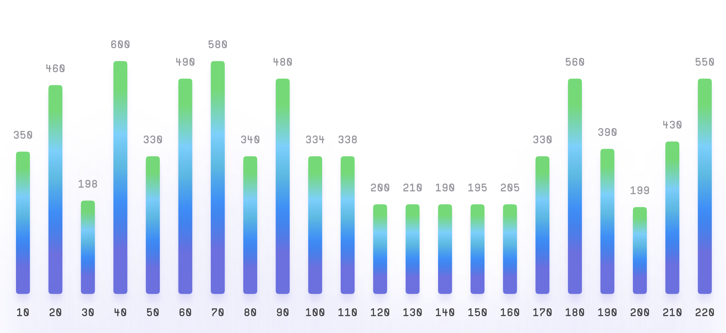
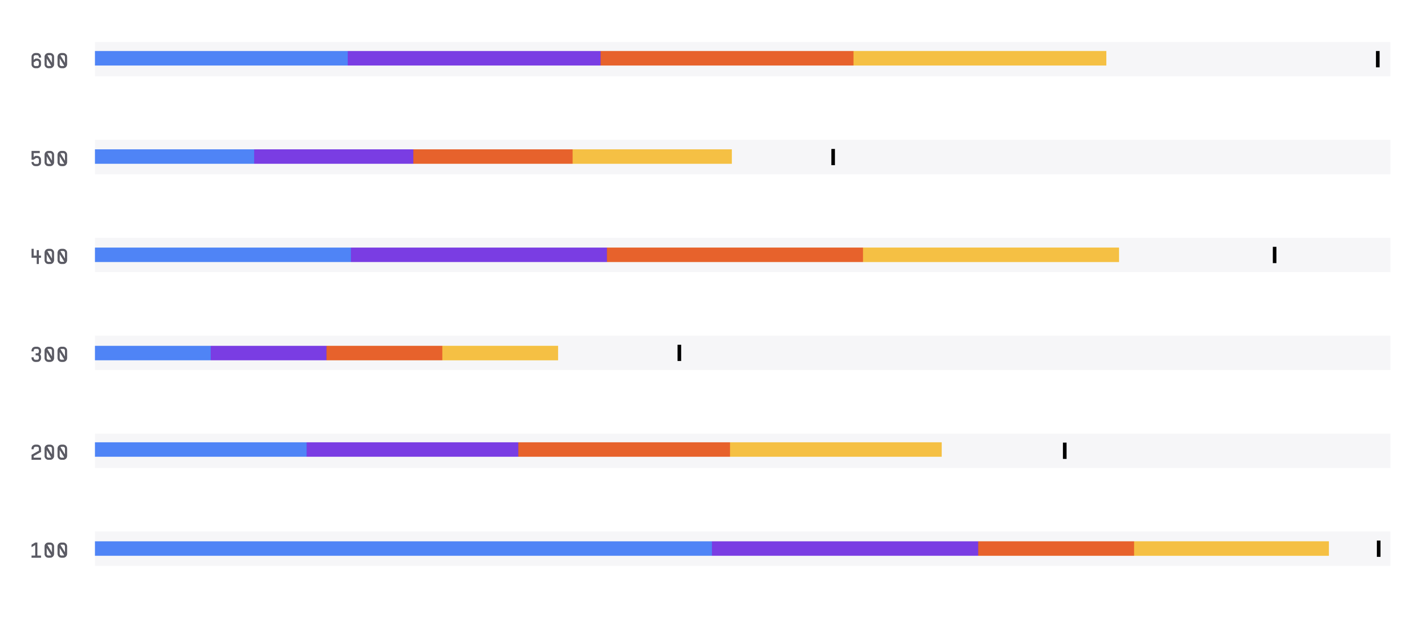
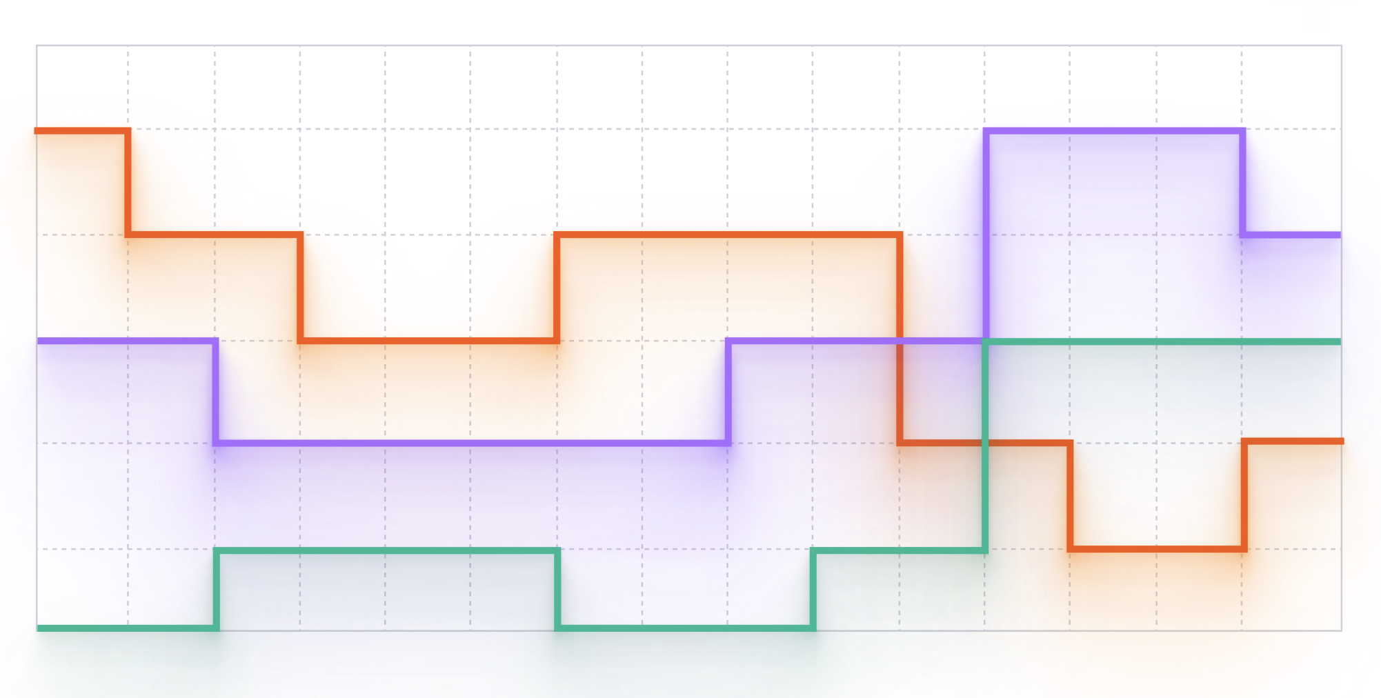
Stepped Line Chart
Stepped line graph, also called a step chart, is a type of chart used to display data that changes abruptly at certain intervals. It is commonly used to show changes in data that occur at specific points in time or values.
Plotting
To build a stepped line graph, you would typically need two sets of data: one for the x-axis (usually time or another continuous variable) and one for the y-axis (the variable you want to measure).
You would then plot the data points on the chart using a series of horizontal and vertical lines that connect the points in a step-like fashion.
Summary
Step charts are commonly used in finance, economics, and other fields to visualize data that changes abruptly at specific points in time or values.
For example, a stock price might change abruptly when a company releases its quarterly earnings report, and a step chart can be used to show how the price changes at that point.
Step charts are also useful for showing changes in data that occur at specific values.
For example, a step chart might be used to show how the price of a product changes at different levels of demand.
Overall, stepped line graphs are a useful tool for visualizing data that changes abruptly at certain intervals, and can be used in a variety of fields to help people understand complex data sets.